The above image is a star plot showing as noted above polar plot of peak height retions of oils #1 and #2 are the same and oil #3 is different. The ratios are plotted on a star to show the differences. A star plot is a graphical data analysis technique for examining the similarities or differences of all the variables in the data set.
Monday, July 7, 2008
Star Plots
http://images.google.com/imgres?imgurl=http://www.humble-inc.com/rof_pic4.gif&imgrefurl=http://www.humble-inc.com/rof.htm&h=311&w=342&sz=5&hl=en&start=5&tbnid=K7uuhLTzqdmZFM:&tbnh=109&tbnw=120&prev=/images%3Fq%3Dstar%2Bplot%26gbv%3D2%26hl%3Den
Correlation Matrix
http://images.google.com/imgres?imgurl=http://www.japaninc.net/files/images/mgz_72_commo-Decorrelation.JPG&imgrefurl=http://www.japaninc.com/node/2356&h=265&w=564&sz=70&hl=en&start=5&tbnid=GztL_3HRVDN0JM:&tbnh=63&tbnw=134&prev=/images%3Fq%3Dcorrelation%2Bmatrix%26gbv%3D2%26hl%3Den
The above image is a correlation matrix of commodities from magazines showing that comodities are indeed a useful asset class in putting together a diversified portfolio. A correlation matrix is a matrix that gives the correlations between all pairs of sets of data.
Sunday, July 6, 2008
Similarity Matrix
http://images.google.com/imgres?imgurl=http://www.lems.brown.edu/vision/people/leymarie/Refs/CompVision/Ridges/Figs/similar.gif&imgrefurl=http://www.lems.brown.edu/vision/people/leymarie/Refs/CompVision/Ridges/Shinagawa.html&h=594&w=731&sz=78&hl=en&start=8&tbnid=5SEo0mmVgBwleM:&tbnh=115&tbnw=141&prev=/images%3Fq%3Dsimilarity%2Bmatrix%26gbv%3D2%26hl%3Den
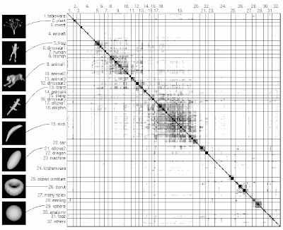
The above image is a similarity matrix of 230 different models divided into 32 different categories. The darker squares indicates the models that are higher in similarity. A similarity matrix shows similarity between two different models.
Stem and Leaf Plot
http://images.google.com/imgres?imgurl=http://mainland.cctt.org/mathsummer/JosephBond/StemAndPlots/images/table2.gif&imgrefurl=http://mainland.cctt.org/mathsummer/JosephBond/StemAndPlots/stem-and-leaf_std.htm&h=395&w=291&sz=6&hl=en&start=1&tbnid=BsYfupzY6aptDM:&tbnh=124&tbnw=91&prev=/images%3Fq%3Dstem%2Band%2Bleaf%2Bplot%26gbv%3D2%26hl%3Den
The above image is a stem and leaf plot showing the infant mortality rates in Western Africa. A stem and leaf plot is a type of graph that organizes data to show its shape and distribution. The leaf is usually the last digit of a number and the other digits to the left of the leaf form the stem.
Box Plot
Histogram
http://images.google.com/imgres?imgurl=http://www.statcan.ca/english/edu/power/ch9/images/histo1.gif&imgrefurl=http://www.statcan.ca/english/edu/power/ch9/histograms/histo.htm&h=295&w=450&sz=15&hl=en&start=3&tbnid=0CjHaDjH8EPexM:&tbnh=83&tbnw=127&prev=/images%3Fq%3Dhistogram%26gbv%3D2%26hl%3Den
The image above is a histogram showing the distribution of salaries from employees working with the Acme Company. A histogram is a type of graph of a frequency distribution where the bars are the widths equal to the class intervals and the heights are equal to the corresponding frequencies.
Parallel Coordinate Graph
http://images.google.com/imgres?imgurl=http://raffy.ch/blog/parallel.jpg&imgrefurl=http://raffy.ch/blog/2007/03/11/parallel-coordinates-in-r/&h=515&w=500&sz=64&hl=en&start=1&tbnid=4jSoGj8BJW9RQM:&tbnh=131&tbnw=127&prev=/images%3Fq%3Dparallel%2Bcoordinate%2Bgraph%26gbv%3D2%26hl%3Den
The above image is an example of a parallel coordinate graph. A parallel coordinate graph is not a normal line graph. The lines represent a time-series data, up and down slopes are changes through time from one value to the next. The single line in a parallel coordinate graph connects to a series of values associated with different variables.
Friday, July 4, 2008
Triangular Plot
http://images.google.com/imgres?imgurl=http://www.beyondveg.com/billings-t/comp-anat/chivers1992p61.gif&imgrefurl=http://www.beyondveg.com/billings-t/comp-anat/comp-anat-6d.shtml&h=554&w=381&sz=12&hl=en&start=15&tbnid=1dnYSwMl_OfzUM:&tbnh=133&tbnw=91&prev=/images%3Fq%3Dtriangular%2Bplot%26gbv%3D2%26hl%3Den
The above image is a triangular plot of three dietary specializations on what animals actually eat (fruits and seed, animal matter, and leaves, flowers, gum and sap). An animal has been plotted within the triangle according to its diet. A triangle plot is also known as ternary plot and graphed with 3 different vaiables.
Wind Rose
http://images.google.com/imgres?imgurl=http://www.srs.gov/general/pubs/ERsum/images/windrose.gif&imgrefurl=http://www.srs.gov/general/pubs/ERsum/data01.html&h=602&w=525&sz=18&hl=en&start=5&tbnid=nwAg0FMPBLLpbM:&tbnh=135&tbnw=118&prev=/images%3Fq%3Dwindrose%26gbv%3D2%26hl%3Den
The above image is an image of a wind rose. A wind rose is a graphic tool used by meterologist to give them a view of the wind speed and direction. The length of each spoke around the circle is related to the frequency that the wind is blowing.
Climograph
http://images.google.com/imgres?imgurl=http://www.uwsp.edu/geo/faculty/lemke/geog101/images/09_climograph_BSh.gif&imgrefurl=http://www.uwsp.edu/geo/faculty/lemke/geog101/lecture_outlines/09_global_climate_patterns.html&h=458&w=400&sz=15&hl=en&start=1&tbnid=UOhYJArUZDVnLM:&tbnh=128&tbnw=112&prev=/images%3Fq%3Dclimograph%26gbv%3D2%26hl%3Den
The above image is a climograph from Walgett, Austrailia. A climograph shows the monthly precipitation and temperature conditions for a selected place (in this case it would be Austrailia). Percipitation is shown by a bar graph and temperature is the line graph.
Population Profile
http://images.google.com/imgres?imgurl=http://camellia.shc.edu/literacy/tablesversion/assignments/Image2.jpg&imgrefurl=http://camellia.shc.edu/literacy/tablesversion/assignments/statisticsassign.htm&h=1568&w=1191&sz=169&hl=en&start=1&tbnid=x09kvrrl1LjMrM:&tbnh=150&tbnw=114&prev=/images%3Fq%3Dpopulation%2Bprofile%26gbv%3D2%26hl%3Den
The above image is a population profile for Mobile County. The age is on the y-axis and the x-axis are the percentages of each age class to the total population divided up into two columns (males and females). There is a smaller percentage of 20 - 30 year olds with a slight increase in the 40 year old range representing migration and the baby boom. A population profile shows the age and sex distributions for any given region.
Scatter Plot
The above image is a scatter plot showing the wife age as a function of the husband age or paired ages. As you can see in the plot above there is a strong relationship between the husband's age and the wife's age...meaning the older the husband the older the wife and vice versa. A scatter plot is a graph of two or more variables that are plotted on the Y-Axis and X-Axis to show their relationship with each other.
Index Value Plot
http://images.google.com/imgres?imgurl=http://water.usgs.gov/waterwatch/regplots/pa01d/pa01d_us_2.gif&imgrefurl=http://water.usgs.gov/waterwatch/%3Fm%3Dpa01d%26w%3Dplot&h=450&w=550&sz=6&hl=en&start=13&tbnid=UFJF3QgC5v36cM:&tbnh=109&tbnw=133&prev=/images%3Fq%3Dindex%2Bvalue%2Bplot%26gbv%3D2%26ndsp%3D20%26hl%3Den%26sa%3DN
The above image is an index value plot for the United States showing the current water resource conditions recorded in January 2001. The information is calculated each day as an average of the streamflow index values for all the stream gaging stations located in the state or water resource region that have at least 30 years of recordings.
Accumulataive Line Graph (Lorenz Curve)
http://images.google.com/imgres?imgurl=http://www.northlan.gov.uk/business%2Band%2Bemployment/local%2Beconomy/economic%2Binformation/lorenz%2Bcurve.jpg&imgrefurl=http://www.northlan.gov.uk/business%2Band%2Bemployment/local%2Beconomy/economic%2Binformation/economic%2Bbulletin%2B8%2B-%2Bpolicy%2Bround%2Bup.html&h=355&w=500&sz=59&hl=en&start=9&tbnid=SxKYKqKoxDK0oM:&tbnh=92&tbnw=130&prev=/images%3Fq%3Dlorenz%2Bcurve%26gbv%3D2%26hl%3Den
The above image is a lorenz curve showing the income of the people in Scotland. The chart shows a slight increase in equality from 2000/01 to 2005/06. The yellow line shows perfect equality and the red and dashed lines are the lorenz curve that shows the actual income. A lorenz curve is a graph that shows the concentration of ownership of wealth and income.
Bilateral Graph
http://images.google.com/imgres?imgurl=http://www.globalhumanitarianassistance.org/New%2520Images/Growth%2520in%2520bilateral%2520humanitarian%2520assistance%25202005-2006%2520copy.jpg&imgrefurl=http://www.globalhumanitarianassistance.org/humanitarian%2520assistance%2520donors.htm&h=380&w=598&sz=76&hl=en&start=1&tbnid=Vz7v7CM0eE3iqM:&tbnh=86&tbnw=135&prev=/images%3Fq%3Dbilateral%2Bgraph%26gbv%3D2%26hl%3Den
The above map is a bilateral graph showing the grown in humanitarian assistance between the years 2005 and 2006 from different countries. A bilateral graph is a graph that shows an increase on one side of a zero line and decreases on the other side of the zero line. The segmented bar graphs are used to show the composition of the variables that is being compared.
Nominal Area Choropleth Map
Subscribe to:
Posts (Atom)